Showing posts with label Fabric Colouring. Show all posts

Needlequest Update - 18 August 2014

Hi!  Welcome to another week and another Needlequest update and piece completed.=)  This is a rather experimental small piece, but I'm quite pleased with the finish,

First I painted the whole flower using the paints I showed you last NQ post.  I was amazed at just how pearlescent the pearl paint is, even more than the metallic, I think!

I created the colours I wanted by mixing pearl, metallic and regular fabric paints together and, although one of the greens came out a little more lurid than I'd wanted, (I should have added red earlier than I did!) I was favourably surprised at how well I'd remembered colour mixing theory!!!

The next stage was to select some colours to stitch with.  I decided to use some of my new DMC threads for two reasons: 1) I bought them and want to use them; and 2) They're easier to select from as they're still all hanging around in clear plastic bags in colour groups, so I can just pick them up and see what I want straight away, rather than mess around with the Anchor colour chart and then fishing the skeins out of the box.  Oh, yes, there's another reason for choosing DMC for this project and that is that, as several other experienced stitchers have noted, DMC shades are brighter and just that little bit shinier than Anchor ones.  One project needs one type and another project the other brand.

Here are the colours I pulled out.  I used five of them - both yellows, both pinks and the brownest green, #580.


Here are the results, the top photo showing detail and the contrasting textures and the second shot giving an overview of the whole piece.


I just need to mount it in a card blank now and get it in the post to my brother tomorrow as his anniversary is on Wednesday.=)

Something for my fellow Needlequesters to think over:

I've noticed that techniques and styles seem to attract better levels of participation than design themes do, so I'm planning on changing the topics for two of the four remaining months of the challenge.  I'm going to leave September as 'Autumn' as that's a fairly easy design theme to work with and, of course, 'Stumpwork' will stay in.  Other than that, I'm considering two from '3D Stitches', 'Hardanger' and 'Miniaturisation' for the other two months.  Any preferences?  Also, as stumpwork and 3D stitches are related, which order should it all go in if we had both of those, would you say?

Text and images © Elizabeth Braun 2014

Needlequest update - 11 August 2014

Here we are again, working on a new theme/technique and I decided to use the lovely hibiscus thread painting from one of Trish Burr's books as the basis of my first (hopefully, i.e. I hope I'll be able to do more than one) experiment this month.  First I did a quick pastel drawing of it on some light blue paper.  The contrast is greater in reality, but it does show up a little here.


I've prepared this piece of blue fabric to work on and am thinking of using these pretty, metallic and pearl fabric paints to provide most of the colour in the piece.

I'll do the leaf in non-shiny paints, I suppose.  The metallic paint pack I bought didn't include the red or green shades, which I thought was a shame, and they only do larger sizes (the same size as the pearl white) in those.  I wouldn't mind that in theory, but in practice, my paint drawer is already full.=)

After painting the flower, I plan to pick out some details in stitch and, all being well, mount it in a card for my big bro's 20th wedding.  As that's in just over a week, I'd better get on with it....  

I had hoped to have got further along by now, but I've been spring cleaning (OK, just pretend I live in the southern hemisphere if you're picky!!), and have been devoting my time to mucking out the bedroom, living room and my study.  Ugh!  All that dust under the bedside tables (nightstands) etc.  No small wonder I was sneezing, dealing with itchy eyes and a runny nose!  I've been allergic to large amounts of dust over the past five years.  Strange.  I never was before.

Text and images © Elizabeth Braun 2014

A Little Ribbon Embroidery

I've had a couple of Crafty Ribbons kits in my kit drawer for a while now and have been meaning to get them worked up.  However, when looking at the designs, I couldn't help but feel that the best hadn't been made of its potential.  This is the 'original', what do you think?  You get a small square of black fabric to work it on and, yes, it's plenty big enough for the design, but really nothing like big enough to put in a hoop.  In fact, although this is my fourth kit of this brand, I've never once used the fabric supplied in the package owing to its over small size.

I decided that the first thing to do was to create a new background and, as I had three small projects in mind that I wanted non-plain backgrounds for (including another kit by CR, the colour choices for which make me wonder how they could bring themselves to put it into production....), I decided to have a go at a bit of painting.  Below are the materials I thought I'd use, meaning to do natural, landscapey sorts of things with them.


And below again are the materials I actually used!!


This is what the piece of fabric with the three painted sections looked like when wet.  Notice that I wet the whole area I wanted to paint first so that the colours merged and spread out well on the fabric. 


And this is what it looked like dry - considerably lighter.  As you can see from the tubes of paint photo, I've used watercolours and I really should have remembered how much lighter they dry.  Having said that, I didn't really mind the change too much as I've made the mistake of having an over-poweringly painted background before.  I also learned that Sap Green' dries with quite a hard edge (as does Permanent Rose to a degree) - something to look out for another time.


The middle of the three was the one intended for this ribbon piece as I wanted to give the impression of a pot of flowers in a yard with a wall/fence (the brown-ish colour) and some greenery (the green spots dropped into the brown whilst still wet), on a paved area (the grey at the bottom).

The embroidery itself took around an hour and, as it was done in evening light and was a quick stitch, there are no WIP photos this time, but here's the finished piece, mounted in a card and looking a lot nicer, I think!


Do you agree?  I do like the general design and love the plant pot button - in fact I'm planning to get hold of a few, probably from the Crafty Ribbons booth at the Harrogate Knitting and Stitching Show, presuming they'll be there.  So that part was good, but I think the black background, to say nothing of the awful slightly blurred and totally 'flat' photograph on the kit was a big no-no.  Not surprisingly, I got this as part of a sale on their website - discontinued kits.

PS, In case anyone's wondering what's planned for the other two painted backgrounds, the simple answer is nothing.  I found the green on the left hand one just too vibrant and felt it didn't go with the ribbon piece I had in mind and the right hand idea just no longer works for me.  I was going to do a small sampler with a crazy quilt appearance as a support for my catch-up on TAST.  I still quite like the idea, but don't think this one worked and so will consider trying another one soon.

Text and images © Elizabeth Braun 2012

TAST 2012 - Week One - Fly Stitch

When I saw the ideas and examples Sharon had put up for the first stitch of the TAST 2012 re-run, I was immediately inspired with plenty of ideas.  I also got out my two stitch guides and found enough variations to fuel the creative process further and, soon afterwards, came up with a design plan for my first TAST sampler. I know that most of the notes didn't show up well, so I must remember to use pencil in a better contrasting shade if I want everyone to be able to read what I've written!

Like Jules (whose wonderful dandelion seed head worked in fly stitch you absolutely MUST see!), I plan to do a doodle pad type stitch sample, then try to work it up into something pictorial.  I can't promise that I'll always manage the pic, but I can try and at least got off to a good start this week.

Here's the quick test run of the stitches to make sure I'd got them sorted worked with scrap ends of no.5 pearl cottons on a piece of rather stiff 14ct Aida (that there was no chance of my using for anything 'polished').  The first few are just plain fly stitches, then a few with longer tails, then a few twisted fly stitches.  The second row shows a rather open worked fly stitch leaf (which does not work well on Aida) and then two rows of fly stitch filling.  This is done by working a row of regular fly stitches with the tops of the Vs touching, then working the next row upside down with the bottoms of the Vs joining and the securing stitch being made over the pair of touching stitches.  This filling spoke 'fence' to me.

First I painted some habotai silk to give the relevant colours to the background.  I made the mistake of putting the whole thing rather too far to the right of the hoop.  It would have been better to have been more central.  Still, I soon realised both the error and that I couldn't really do anything about it, except to ditch that piece and start again, but although I found I had more habotai than I'd feared, I'm still not up for wastage.  It was good to try silk painting again, even though I found it a fair bit harder than I'd remembered.  Need more practice, I know and having more fabric than I thought means that I can try this kind of background again soon.=)

So, here's the finished fly stitch pictorial piece.  Most of the stitches are some form of fly stitch, except some stem stitch for the foreground roses and, of course, the ribbon work (although you can work fly stitch in narrow ribbon to good effect).  The peach flowers are just straight stitches in ribbons, and the roses are spider's web roses.  Let me know if you want to know how the latter are done as they're easy, quick and effective.  The grass tufts are individual twisted fly stitches and the rose leaves are worked in closed fly stitch.


On the whole I'm happy with the piece.  The bit I'd most like to change (and could have if I'd been up for a lot of un-picking and re-stitching) would be to work the fence in a narrower gauge of thread.  I feel it's far too prominent, although the basic idea etc is OK.  Even with that, I'm pleased with this first week's work as I've been able to use fabric colouring again, I've designed something completely from scratch with little more inspiration than the stitches themselves and I worked it completely freehand - no pattern transferred to the silk.  Oh yes, and I really know fly stitch and a few variations of it quite well now!!

What's that just about the roses?  Well, of course it's a FLY!=)

© Elizabeth Braun 2012

Why I'm Looking Forward to TAST 2012

If you haven't heard that Sharon B from Pin Tangle is re-running Take a Stitch on Tuesday next year, then where have you been??!=)  Umpteen stitching bloggers have posted about it already, but in case you've missed it, then here's the challenge home page and there's also a permanent link to it in my sidebar.

So, there'll be a different stitch posted and demonstrated each Tuesday, giving a whopping great 550 (and increasing) stitchers the chance to learn new skills and find new points of departure for old ones.  For some, almost every stitch will be a new challenge as they're new to surface work.  Others will revisit old friends and make new and yet others will just join in for consolidation and fun.  I fall into the middle group really as I have a passable repertoire, but still have plenty to learn and discover.
What I'm really looking forward to about it is not actually the learning of new stitches - as I have a number of stitch guides and I learn stuff here and there when working new styles/designs etc and that's fine.  I suppose I learn what I need to as and when I need it.  For me, the big thing is a bit beyond that -more into creative design and usage of the stitches covered.  In effect, I'm looking at it as a sort of City & Guilds samples project revisited.  Throughout this posting, you can see some of the small pieces I did whilst working on the City & Guilds level 3 certificate in embroidery, (which I, sadly, wasn't able to finish) and you may have seen already on my C&G page here.

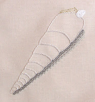
Working through the design module and samples project, we had five design elements and five major themes, broken down into smaller areas each time and a type of work and/or number of stitches learned with which we were to interpret our designs.  To make that clearer, the syllabus requires that you cover line, colour, shape, form and texture.  Our teacher chose big themes for each area, so line was living creatures, colour was gardens and flowers, texture was buildings, shape was Art Nouveau and form was landforms.  Each week we then had a smaller area to produce some artwork and a design from which we would then interpret in textiles and suitable stitches.  Here you see my shell as part of the line module interpreted in linear stitches.  Above are samples from the colour section, one topic being flower borders, which was then worked in knot stitches on painted silk and other was hedgerows being worked with broderie anglaise stitches.

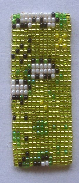
What I'm trying to say here is that I would like to do something like that again.  I think it will take a few weeks of the challenge to see how well it can be achieved as I don't know how much can be done in this way with just one major stitch (although there's no reason why one can't use others to support it, as long as the main TAST stitch of the week is the central thing, no?), and I'll have to chose my own themes and topics, which could lead to less creativity in that I may just settle for the easy option instead of challenging myself like the C&G classes did.  The sample you see here is a section of snakeskin done in loom bead-weaving!  I was rather disappointed when I went to the local C&G micro-centre last summer to see their exhibitions and could see none of the obvious design inspiration that I was used to from my old course.  Everything looked like shapeless masses of stitches instead of resembling something and that just wasn't what I wanted...=(

I also want to use more of the lovely fabric colouring things I bought for the C&G course, such as these silk paints, fabric paints and dyes.  I also have watercolour paints, which Kit Nicol (amongst others) uses in her pieces to colour her backgrounds, and some Derwent Inktense pencils, which can be used in a similar way to silk paints and dyes.

Here's something quite novel that I thought would make an interesting fabric colouring method.  Can you tell what it is?  To the left is the matte palette and on the right are the shimmer shades

Yes, you're right!  It is, indeed, eye-shadow!  And look at all those useful brown and green shades!  I got these two palettes on e-bay and, aside from the feeling that they could have made more of the 88 shades they had (given a better spectrum, and certainly fewer greens!!!), I love them and am keen to put them to other uses than what they were originally designed for - although I like them as make-up as well.=)  Despite being quite cheap, Chinese made products, they're actually quite good and, with a layer of primer, last surprisingly well and have plenty of pigment so give a good colour pay off.  Not that I've been brave enough to use that vibrant emerald green on my eyes...

Speaking of things Chinese, I'll leave you with this wonderful example of Oriental initiative and multi-tasking.  Here's one of our Chinese friends, Yufei, selecting from the menu, whilst balancing her 4 month old son's bottle with her chin.=)  Priceless, isn't it??

And it's snowing.....

Of course, by the time I'd finished the fine-tuning of this posting, the snow had stopped and the sun came out!!!=)  Never let it be said that British weather is monotonous!

© Elizabeth Braun 2011
Older Post ►
 

Copyright 2011 sew 4 love is proudly powered by blogger.com